GDF – S2 – 2011

Conduct research / Evaluate the nature of design in a specific industry context

Automotive Typography †

by vivalabonita007

I’ve chosen to explore the world of car logo’s and emblems and the history + typography + design used in their development. Starting with the companies themselves (inc; toyota, mazda & nissan). Then onto their racing devisions (Eg; TRD,[toyota], MPS[mazda], & NISMO[nissan] Then finally onto the model emblems and the typography structures used to construct the badges that we all use to tell our cars apart ( eg; supra, silvia, Rx-7, GT-R). And some of the  hidden messages that lay within them. Then perhaps dabbling in japanese motorsport subcultures as a representative of where these emblums are at today. Here’s a sneak peak at what’s to come:

Cool stumbled upon designs ;D

by vivalabonita007

What makes a product really stand out in this day and age?  These designers have

This liquor Gun looks very similar to .45 but instead of bullets it’s loaded with 200 ml of genuine Mexican tequila by Hijo’s

Creative fruit juice packaging by Japanese industrial designer Naoto Fukasawa

Stop tea from falling all the way in, yes please!

by soon mo kang

by Donkey products

This food label changes its color by reacting to ammonia given off by food when it is becoming spoiled.

Concept by To-Genkyo

Stranger absinth- classic but classy

recently print magazine approced four design and packaging firms with a simple brief: if marajuana was legal how would it be packaged? the favorite packaging concept comes from this one after the heads of state.


Why stop at just the packaging itsself? this japanese group has focused there design on there barcodes.

Beautifully handmade package, the show cases contain the 17 key/natural ingredients that make up the Red Bull Cola taste


Meet google, the noun that became a Verb.

by vivalabonita007

As defined by wikipedia, infographics are visual representations of information, data or knowledge. These graphics are used where complex information needs to be explained quickly and clearly, such as in signs, maps, journalism,  technical writing, and education. They are also used extensively as tools by computer scientists,mathematicians, and statisticians to ease the process of developing and communicating conceptual information. Nowadays however Infographs can an are being used to represent almost everything. When properly executed infographs should be both beautiful and meaningful, allowing the viewer to decipher data and recognize trends while admiring its aesthetic appeal.

I cant help but notice the increased amount of “google” info graphics that keep popping up. Google has perhaps more than any other company become “The Internet Company.” It’s grown hand in hand with the internet and its entire business model has from the start been totally focused on the internet as a delivery platform. And let’s face it, Google is a pretty interesting company. In fact,  it’s so interesting that hundreds of people have put together really interesting infographics with a ton of facts and figures about Google. Just like these examples, so we can find out just how big google really is! Patrick Clair took google infographics one step further and created a google profile motion graphic which you can check out on his website.


http://dailyinfographic.com/

http://columnfivemedia.com/what-is-an-infographic/

http://patrickclair.blogspot.com/

http://royal.pingdom.com/2010/02/24/google-facts-and-figures-massive-infographic/

European Car logo makeovers- Volkswagen, Audi & Mercedies-Benz

by vivalabonita007

Volkswagen

Volkswagen means ‘People’s car’ in German. The history of the company is tied with Adolf Hitler.
Before the rise of Hitler, the German economy was in a very bad shape; as a result people couldn’t afford to buy cars. In 1933, Hitler raised the idea of an inexpensive car in the Auto show.In 1934, Ferdinand Porsche met with Hitler to design the car. Hitler gave him all the specifications of the car and Porsche promised to deliver the design. In 1937, the Gesellschaft zur Vorbereitung des Deutschen Volkswagens mbH was created (it became simply Volkswagenwerk GmbH a year later). In 1938, Hitler opened a state funded Volkswagen factory in Walburg. It was suppose to produce commercial cars, but it was used to churn out military cars. It was only later found that Hitler had intended to use the Porsche car as a military vehicle only, which could carry 3 men and a machine gun. After the WWII, Britishers took over the company. They renamed the car as Beetle.
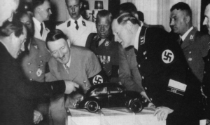
Surprisingly all the car makers like Fiat and Ford declined to take ‘free control’ of the Volkswagen factory. So, it was returned to the German government, and went on to become one of the world’s bestselling cars ever. The first logo was designed by Franz Xavier Reimspiess, a Porsche employee during an office logo design competition. The main part of the logo hasn’t changed much, but understandably after the WWII, they got rid of the design around the circle which seems to be inspired from the Nazi flag. The colors that were added in 2000, to the logo which was built after WWII, it depicts a positive change in the company and the ability to adapt to the new millennium.

Audi
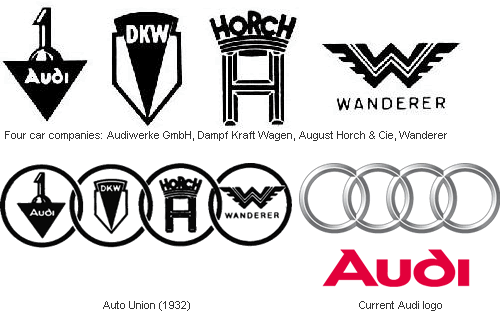
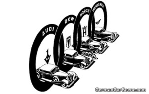
German engineer August Horch, who used to work for Karl Benz, founded his own automobile company A. Horch & Cie in 1899. A decade later, he was forced out of his own company and set up a new company in another town and continued using the Horch brand. His former partners sued him, and August Horch was forced to look for a new name. When Horch was talking to his business partner Franz Fikentscher at Franz’s apartment, Franz’s son came up with the name Audi, And so Audiwerke GmbH was born in 1910. In 1932, four car makers Audi, Horch, DKW, and Wanderer merged to form Auto Union. The logo of Auto Union, four interlinked rings that would later become the modern Audi logo, was used only in racing cars – the four factories continued to produce cars under their own names and emblems.
 

Mercedies-Benz
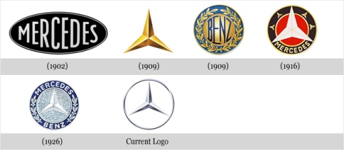
The Mercedes-Benz was formed by the merger of two car companies – DMG (Daimler-Motored-Gesellschaft, founded by Gottlieb Daimler) and Benz & Cie, founded by Karl Benz. Both the companies were similar in their work and were situated in close proximity.It was after the World War I, when the German economy was shattered, that both these companies decided to from a syndicate in 1924, and then finally merge in 1926, called Diamler-Benz.In 1902, the logo for Mercedes was nothing more than the simple company name. However, it was changed to a 3 pointed star in 1909. The origin of this star came from a postcard by Diamler, where he had drawn a 3 pointed star which represented ‘making vehicles in land water and sky’.After 1926, a new symbol for Mercedes-Benz came into picture, where the original logo of both the companies was merged into one. It combined the 3 pointed star of Mercedes and the laurel wreath of Benz.Over the years, the symbol has been improved vastly in design and simplicity. It has been recognized as a symbol representing luxury and top tier cars.

Magazine Design [WoODenToyQUartErLY]- ^^ad!!

by vivalabonita007

Wooden Toy publishing Co is an independent micro-publishing house founded by Melbourne born Art director – Timba Smits.Timba Smits is an award winning Melbourne born / London based graphic designer, artist and illustrator. Wooden Toy quarterly is possible the most design heavy contempoary culture and art publication ever printed in australia. Wooden toy is the only quarterly boogazine (half book half magazine) to come out once per year.


With only 5000 issues prined
and individually hand – numbered the magazine has quickly become a collectors item among design junkies, creative addicts and culture feinds.Wooden Toy is not only a publication worth collecting for its design alone, but for its aim to document and highlight emerging and established creatives that have in some way been influenced by contemporary culture, design and art while drawing in the creatives that Timba thinks can be, and are, an influence or inspiration to others. Many may not know that Wooden Toy stareted its humble beginings like many magazines just a simple street kid, editions one to three were carefully distributed as free street press magazines throughout Australia during 2006 and early

2007, with 6000 copies per issue being lifted from the streets with a 100% pick up rate.


http://www.timbasmits.com/about

http://www.woodentoypublishingco.com/