GDF – S2 – 2011

Conduct research / Evaluate the nature of design in a specific industry context

Typography taking the lead Role,

by justinebarratt

– as eye catching as a picture.

My inspiration for this project is to take a thoughtful investigation into common design elements of typography. Typography has become the entertainment without even having to be read, becoming the new navigator, through use in shape, colour palettes, & textures, turning itself literally upside down. My bottom line is to see what people are currently enjoying to stare at, what’s making a mark.


How I think the Fine Print, became Packaging’s Point of Sale

by justinebarratt

Remember a decade ago when we had to carry around a ingredient decoding book to the super market, commerce drove food industry to chemical warfare, and our food was making us sick, terminally ill. We were forced to turned the lights back on in the factories that were processing our foods, to our horror we saw that we shouldn’t trust these manufactures, breeding consumer distrust, we turned away from the mass food production and began to look back to our own back yards, Nana’s jam’s, the local farmers market, and here began the rise of the hand made market, back to the days where things were simple honest, the fine print became the big print as companies raced to expose themselves as honest, trying to becoming ethically transparent clean and respectful.

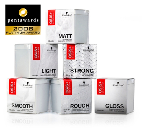
New trends started appearing, things became pared down, the use of simplistic shapes, block colour, typographical packaging, vintage design, (we became nostalgic for brand that reflected the good old days when things when’t so abstract & distrustful) added into this mix, has been the VERB, what a product will do for you, BLISS, HELP, HIGH and product names became simplified like WOOD, SMOOTH, ROUGH, QUENCH, we desired to be seem as simple,yet intelligent, minimal, fresh, healthy and readable.


http://www.bittbox.com/inspiration/100-minimal-and-typographic-package-designs


http://www.unstage.com/2010/03/simplicity-in-product-packaging-80-examples/


http://www.thedieline.com/blog/2009/5/12/top-15-fonts-for-packaging-design.html

The How 2’s

by justinebarratt

10 tips for better infographics  ( IG’s )

The use of infographics to communicate complex information simply and quickly picked up momentum in 2005 with the popularity of Digg, Reddit and other social media aggregators. It’s become almost too-popular as a way for bloggers to liven up posts, media to add impact to news stories and for content marketing experts to generate viral content.

Subscribe to  daily Infographics every day by email. – http://dailyinfographic.com/

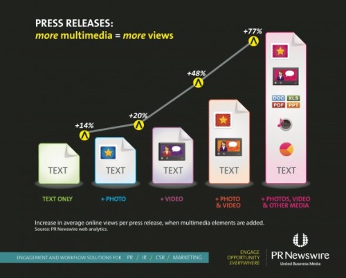
Effective PR Newswire IG shows more multimedia = more views, up to +77%


  1. Keep it simple: if there was ever a need for the KISS principle, IGs are it. Complex or over-complicated visuals are never effective.
  2. Check your facts: incorrect info decreases your credibility. Always fact check and proofread.
  3. Design counts: simplicity is a virtue when it comes to effective visual communication and bad design is… well… bad. Good design, strong headlines, choice of type, effective layout and use of white space are all essential.
  4. Color works: use color for maximum impact but don’t use it just to be colorful. Know which emotions colors convey but, most important, trust your gut instinct and first impressions.
  5. Numbers must add up: surprisingly, the numbers are occasionally wrong or don’t communicate what you want to say. Too many numbers can also be confusing. Check them carefully.
  6. Enhance narrative: make sure the visual adds to your narrative. Just like TV, a good story is even better with a great visual.
  7. Keep text brief: the best visual presentations use only essential text. Stick to the minimum number of words to tell the story compellingly.
  8. Size matters: keep the size of your file to the smallest possible for fast downloads but retain the quality of your image for best impact.
  9. Don’t overdo it: use visuals sparingly and don’t use an IG in every post or on every page. Like most things, too much of a good thing… is a bad thing.
  10. Credit where credit is due: respect copyright and always credit your IG sources. It’s the right thing to do.

5 Unbeatable Types of Infographic + Free Tools to Create Them: Ann Smarty shares best examples and free tools to help create your own IGs. http://www.searchenginejournal.com/5-unbeatable-types-of-infographic-free-tools-to-create-them/

10 Awesome Free Tools to Make Infographics:  Makeuseof.com offers a helpful list of DIY tutorials and programs. http://www.makeuseof.com/tag/awesome-free-tools-infographics/

40 Useful and Creative Infographics: impressive, must-read collection of IGs, several of which communicate superbly. http://sixrevisions.com/graphics-design/40-useful-and-creative-infographics/

Best Infographics: this site by the iAF Team often is the best source for compelling IGs. http://www.best-infographics.com/

Chart Porn: don’t be misled. This site really does provide superb “data visualizations you just gotta love.” Note, it is office friendly and great collection of beautiful charts, graphs, maps and interactive data visualizations from around the world.  http://chartporn.org/

Cool Infographics: a blog and useful source for great IGs. http://www.coolinfographics.com/

Daily Infographic: get a new IG every day. Totally random; totally awesome. http://dailyinfographic.com/

Data Mining: blog covers IGs, social media and data mining. http://datamining.typepad.com/

DIY Guide to Successful Infographic Production: Voltier Creative shares seven excellent tips to better IGs using what else… an infographic. http://voltiercreative.com/2011/04/diy-guide-to-successful-infographic-production-by-voltier-creative-2/

Flowing Data: Nathan Yau explores how designers, statisticians, and computer scientists are using data to understand ourselves better through data visualization http://flowingdata.com/

Good Infographics: see effective IGs at a glance; regularly updated and an excellent http://www.good.is/infographics 

How to Create an Infographic- 44 Places to Find Tutorials and Tools


Channel Rebranding – It’s a badge of honour’.

by justinebarratt

ABC 1   &   ABC 2


Digital Pictures was awarded this significant branding project based on their design ability to demonstrate how they would differentiate the brands in an ever-increasing multi-channel environment – a key component of the brief. ABC1 being the place for high-quality, trusted content and ABC2 being home to quirky content for younger viewers.

This project was made more challenging and interesting given the brief to retain existing viewers and to engage with a younger working family demographic whilst retaining the image of ABC as a destination for ‘truth’ and ‘credibility’. The ABC is also positioning ABC1 as the home of intelligent entertainment. Our “Think Entertainment” tagline conveys both these ideas in a sophisticated and visually exciting way’.

As usual with the ABC,  little time, not much money and loads of ambition.

Digital Pictures created six network idents for ABC1 that incorporated live-action narrative, 3D animation and visual effects. In these idents 3D animated photo-real ‘thought bubbles’ emit from the minds of different characters, bursting with playful graphic images reflecting the breadth and excitement of the network’s content.
Finn Spencer adds: ‘This wasn’t just another job. We were passionate about delivering quality design that was visually compelling. Every good motion designer in Australia aspires to work on a network rebrand as prestigious as the ABC, at some stage of their career. It’s a badge of honour’.

From a branding perspective, the design team reworked the ABC typeface logo to compliment the ABC News logo. The design team created a new font for the numbers 1 and 2, and the ABC1 logo was updated with a new colour palette of aqua and burnt orange, colours that represent the Australian landscape.

The new Branding looks contemporary and aspirational, ABC1 has blue heritage, and its new look has a credibility clean vibrancy, I love the new colour palette especially the ABC two pink and olive green.

View the channel IDs at http://www.digitalpictures.com.au/node/195
Visit http://www.digitalpictures.com.au http://www.omnilab.com


ADBUSTERS

by justinebarratt

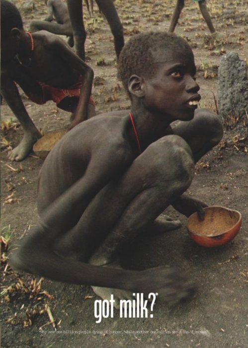
Why are one billion people dying of hunger while another one billion are dying of excess?


‘there is also something dumb, trite and scary about the way we view the world and our place in it’.

Richard Neville

The spark that lights up Australia.
5 comments Richard Neville , 19 Jul 2011

ADBUSTERS MAG is a global network of culture jammers and creatives working to change the way information flows, the way corporations wield power, and the way meaning is produced in our society. This magazine can keep you tuned to the techniques corporations are using to preen our culture to become enslaved, who said slavery was a thing of the past in western countries Ha! ADBUSTERS is dedicated to reinventing the outdated paradigms of our consumer culture and building a brave new understanding of living. http://www.adbusters.org/magazine

Adbusters relish all truly political materials, whether they be scholarly probes into the decline of civilization, environmental forays into the forests, sci-fi carpet rides into cyberspace or humorous spoofs about commercial culture. More than anything, Adbusters seek compelling ideas that further the critical perspective and offer activist solutions. Our language is culture jamming: the new activism. http://www.adbusters.org/campaigns

Adbusters audience is global. They  have subscribers in 40 countries and are on newsstands in North America, Australia, the United Kingdom and Japan. The circulation is 120,000 and constantly growing. Adbusters are neither left nor right, but straight ahead. Many of the readers and contributors are serious activists on the academic, entrepreneurial, environmental and communications fronts. http://www.adbusters.org/support_subscribe

You can submit too,

the Submission Guidelines are 

http://www.adbusters.org/about/submissions