GDF – S2 – 2011

Conduct research / Evaluate the nature of design in a specific industry context

Intelligent packaging, clever design or simply a throw away gimmick

by antisocialskateboards

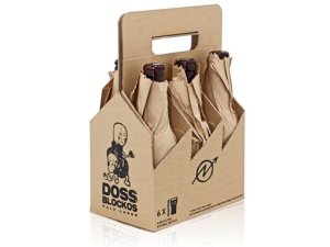
In todays over crowded society there appears to be and endless line of companies popping up almost over night and vying for there place in an already saturated market. Many of these companies and their products are short lived, but what about the others ones that stand strong and survive. What makes these companies so different form their competitors. Are they really a more superior product, more competitively priced or does it come down to intelligent packaging. With so many similar items for sale, isle after isle in any given supermarket or store it would certainly make sense that standing out and being noticed will in all probability give you an edge over  your competitors. Clever packaging design is certainly one simple way of achieving this goal. Below is a selection of various different products that have been designed to grab your attention. Are they simply gimmicks or clever design.
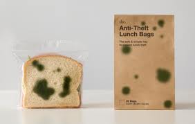
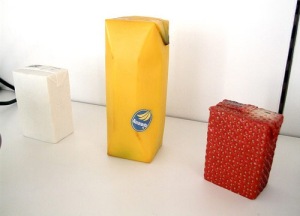
                                       These are just some of many great and maybe not so great packaging ideas I came across. Hope you enjoyed having a look at them. And please check out the links bellow as there are so many great packaging designs out there to discover. Enjoy.

http://creativenerds.co.uk/inspiration/30-clever-and-creative-package-designs/

http://www.presidiacreative.com/179-totally-clever-and-creative-package-designs/

http://www.crookedbrains.net/2010/01/design_07.html

http://www.graphicfetish.com/31-clever-packaging-ideas/


Peeling back the packaging

by mishydee

Fruit

Michelle Davies

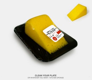
There are some very creative methods of using the freshness of fruit to help sell products – whether they are made from fruit or not.

Above are some of the creative packaging solutions for selling juice.

Top left is packaging by Japanese designer Naoto Fukasawa. Designed to look like the fruit they come from, there is little to no text or other elements to distract from the fruit. He simulated the look, feel and texture of the fruit flavour contained within.

While I love the coconut water in the shell (top right), I think it really only works if the shell is able to be used from the manufacture of the water and is in effect using 100 per cent of the material. Also there may be shipping issues if trying to export the shells to other countries – quarantine or pest/disease issues.

I do love the shaped juice boxes, I can imagine that kids and adults would love them and think they would sell well just for their design value. The work is from Australian design student Yunyeen Yong. Impressive for project work!

The bottled water is beautiful and makes me want to drink it NOW. Simple design but so effective. It looks refreshing and appealing. It was designed by Pemberton and Whitefoord for Fresh and Easy sparkling mineral water.

Unfortunately only a concept, this Quick Fruits packaging is by designer Marcel Buerkle, but looks so delicious I wanted to include it.

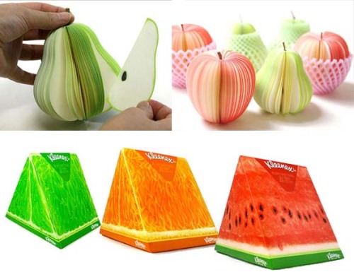
Above is notepaper designed to look like fruit. Designed by Masashi Tentaku, a tree twig is used as the stem of the notepad and is sold with netting to create the realistic fruit look. The only downside is that you would not want to ruin such a beautiful design by using them!

Below them are the Kleenex summer range of tissues. The juicy fruit slices illustrations were created by Los Angeles-based illustrator Hiroko Sanders. While tissues arguably have nothing to do with fruit, they do look great and are far more fun than normal tissue boxes.

LINKS

Package Design Website

Fukasawa fruit juices and other lovely packaging

Unusual creative packaging

Interesting Blog

Fabriano Boutique Italia

by lucanakin

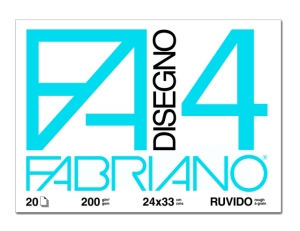
Since 1264 Fabriano has been synonymous with high quality paper, esteemed throughout the world and known to publishers, writers and artists. Indeed, although the invention of paper is traditionally ascribed to the Chinese and its introduction to the West attributed to the Arabs,

the people of Fabriano must be given the credit for their ability to engender a true leap in paper quality and to make Fabriano the cradle of the production of modern paper.

All the forests that provide the wood-pulp for Fabriano paper are controlled and properly managed to ensure the new growth of the trees, and production processes respect the current environmental norms, often exceeding them in rigor when they work with paper certified ECOLABEL.

Fabriano Boutique puts forward merchandise that is a symbol of tradition and prestige throughout the world because it brings together the value of paper with the skill of master artisans and the creativity of great designers.

 SOURCES:

http://www.fountainpennetwork.com/forum/index.php?/topic/190478-fabriano-bouquet-notebook-set-review

http://www.fabrianoboutique.com

http://www.youtube.com/watch?v=tF-SOTd6G2w

http://www.behance.net/gallery/Fabriano-Boutique-Spring-2011-Installations/1192623

http://blog.gessato.com/2011/02/25/150-italiani/

Alcohol Packaging Design – SAM

by samdavis217


Alcohol Design


Alcohol packaging design is a massive area of innovative and creative design.

There are thousands of alcohol companies fighting with each other for sales, sometimes its just a  matter of how nice your packaging looks that determines thewinning factor.

No matter what your poison, our drinking culture is heavily influenced by big brands, their labels and their signature bottles. Take Absolut Vodka for example, which for many years has run an internationally recognised campaign based on the image of the clean and simple lines of their vodka bottle, in the process making it a modern icon of design.


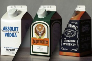
German designer Jorn Berger is getting us to rethink how packaging affects our drinking preferences in a series called Ecohol. He has repackaged some of the world’s best known alcoholic drinks, putting them into Tetra Pak cartons.


Not only do Berger’s designs challenge us to rethink what really influences our consumer choices, they also offer us a sustainable packaging alternative to glass or plastic bottles. Cheers to that.

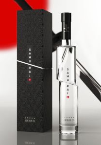
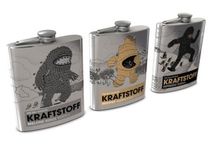
Here are a few more great packaging designs, some clean and simple and some incredibly creative and fresh.


A Stylish Goon Bag..


LINKS – 

http://lovelypackage.com/jonah-and-the-whale/
http://visionwidget.com/showcase/ads/434-alcohol-packaging-design.html
http://acrisdesign.com/2011/07/beautiful-alcohol-packaging-designs/
themadgazine.com/post/…/30-creative-alcohol-packaging-design
http://en.wikipedia.org/wiki/Packaging_and_labeling

The Apple of my eye ~ Will Neill

by blkthread

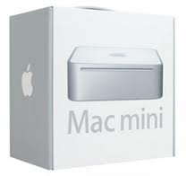
When it comes to successful packaging i don’t think anything can surpass Apple, as obvious as it is i think it needs to be mentioned. Its the simplicity that has made Apples packaging so well known. Generally just a front on image of the product, usually to scale will sit prominently on the box with the product name in simple bold text, sitting on a clean matt either black, white or grey background. The other key aspect of the design is the size of the packaging, over the years Apple have continuously brought out their products in smaller and tighter packaging, when looking at the box you wonder how the product even fits inside. The minimalism doesn’t stop on the exterior either, when opening, your greeted with nothing but the product itself, a couple of accessories and the support that stops it from rattling around, not to mention that new smell.

So how has the less is more approach been so successful? The words that come to mine are sterile and quality. When purchasing an electrical appliance you want a simple and easy to use product that gets the job done. To all who are familiar with Apples product design and software design, you will understand how well the packaging actually portrays the product. In the end you are left with something so minimal that it looks as if its barely even been designed at all. Its an a egotistical approach, as if Apple are saying why would we need to spend time on our packaging when everyone already knows how good our product is. Apple have succeeded in producing something that combines advanced technology with style, and an entire experience around buying a product.

PACKAGING BOOKS – EYEBALLS

by ilebrinsmead

Making clever packaging unique and different for books, in particular, can be a perilous journey with many checks and balances.  The least to say, packaging design turns into disaster once exposed to the challenge of critics and naysayers.

Best to get an outside opinion to discover fatal flaws as part of the proofing process before it gets out there. And before signing off on your packaging, check thoroughly and carefully the following:

  1. Packaging
    • hold weight
      free from dampness
      hardcover editions, spine straight against box’s side
      wrap or pad, if necessary
  2. Bad images
  3. Type/face on package
  4. Packaging message/s is rightly conveyed through images and words
  5. Verbiage is not offending
  6. Integrate product packaging into your brand
  7. Pitfalls – environmental issues, legislation counterfeiting, product packaging security

I found in the Internet these custom packaging designs pieces exquisite:

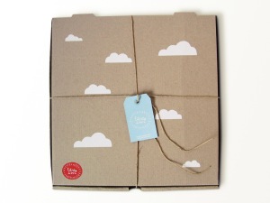
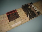
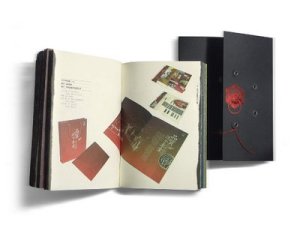
Lebrito de mi – packaging is low cost and design has an artisan resolution and conveys warmth and originality of the product.

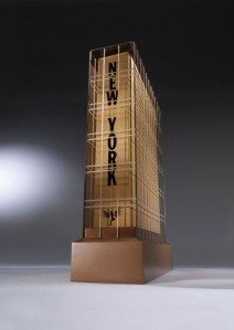
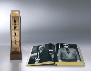
New York – designed by Swedish Henrik Persson. Book weights 16 kgs, vertical standing, packaging/display stand made in Perspex and literally looks like a building/skyscraper.

5th Gymnasium –  a monograph in one of best/oldest high schools in Zagreb, packaged book in pencil case, brand’s the schoo’ls visual identity in Mathematics (upside-sown 5 reads like G).

Vinexport’s bag-in-boxes: wine packaging or old books – Awarded at the 2008 Bronze Pentaward, a worldwide packaging design competition, packaging was designed to support the brand identity by rendering the image of an old book to differentiate the Grapefruit product in the marketplace. This meant modernizing perceptions on the bag-in-box wines.

Chinese Book Packaging

Packaging Launch
Packaging Diva
Moving About Step by Step Guides – Pack Books
Lovely Package Books
Randommization – This is how I like my books carved and filled with olive oil
Packaging of the World – Chinese Book Packaging

Less clutter or going for simplicity…

by Helene

Clutterless packaging or going for simplicity seems to be fuelled by the changes observed in consumers choices as we fall further into introspection from consumers:  Yes, I’m hungry and poor. So, how can I eat like a king but pay like a pauper?  Yes, I want to look good but how can I afford to without destroying the planet?

The in-house design studio set up for Woolworths department store in South Africa has begun rolling it’s first new packs out onto shelf, the initial stage of what will be a mammoth packaging redesign program, eventually encompassing more than 5000 items considered the basic supermarket items with a price tag that will make customers smile. The packaging redesign is meant to ensuring all items communicate the quality which defines Woolworths’ very essence, by embedding good, thoughtful design into the brand through packaging.

Simple, bold typography and the use of elements like photography and graphic shapes, aim to speak to the consumer in an engaging, intelligent way. Colour is also used in category leading ways, to differentiate variants within the lines.

The British supermarket chain Waitrose knows how to seduce its clients yet keeping them tantalized. Their home brand packaging is a no-frill design style, using large typography and fonts that can be read from far and also enhancing the product, yet keeping it a little raw, almost organic – straight from the producer!  The spice rack and other products look  very clear and readable with no pictures to confuse.

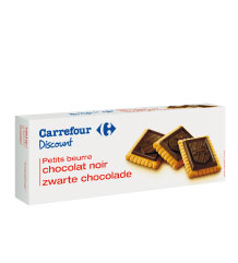
Carrefour another popular supermarket  chain in France and Germany created Carrefour Discount, a cheaper option brand available for all staple foods in a packaging much cheaper to create. This was necessary due to the recession which translated in sales declining.

Repackaging is an economical necessity in the current  GFC climate.

During the recession in the USA, it became even more acute, as a significant decline in makeup and fragrance sales in the USA was noted. Brands started looking at their packaging and reverted to retro-inspired looks with a more organic or environmentally friendly appeal which changed the perception of the public on those long time prestigious brands, emphasizing the 100% recyclable aspect on a domestic level.  It was also difficult and costly to print the old packaging and with sales down, changes had to be made.

Often times one can observe away from the necessities of the economy and recession that necessity items with a clutter less look and simple design, seem to attract attention. Spring waters and juices which have to fight for shelf space are a source of inspiration for “pure” designs – conveying a clean, fresh and organic look which inspires confidence in a consumer.

http://www.beautypackaging.com/articles/2009/03/online-exclusive-repackaging-during-the-recession

http://www.unstage.com/2010/03/simplicity-in-product-packaging-80-examples/

DVD Packaging – Brett

by johndoedesigns

Dvd packaging has come along way since the first release of DVD’s, Originally released the film poster as the cover with the blurb and photo’s on the back, they now will sing you a tune, Say your favorite lines from a movies and even light up!

Over the last 6 years DVD companies have released more and more elaborate yet much more expensive collector editions of everyones favorite DVD’s, They are selling the toys or gadgets more than they’re selling the actual DVD. It’s as if the DVD or Bluray is just additional requirement for the toys to sell more but because they’re supposed to sell the product as DVDs, then they make a packaging out of the toy.

Here are a few of the top DVD packaging over the past few years –

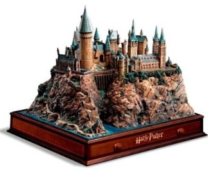
Harry Potter Hogwarts Castle – Hogwarts Castle with wooden base Including all six Harry Potter movies and a protective plexiglas cover. 500 pounds!!

The Terminator box set – terminator endo skull, Blu-ray. His eye’s light up & it speaks lines from the film.

Band of Brother – Military kit It is a replica of a Military Kit that contains a big digipack, numerous replica maps/leaflets, dogtags and a numbered card. What I love about it is that the whole packaging doesn’t look like it’s trying too hard unlike other Special Edition DVDs that try hard to be unique that everything’s just a big bunch of random mess. You’re lucky if you get to purchase one because its very rare- limited to 6,000 worldwide.

Scooby Doo box set –

Special edition packaging. In the shape of a Mystery Machine van, the box set features LED lights that glow from the front and back of the box set (the head lights and brake lights of the van), plus a groovy soundbite that plays the What’s New Scooby-Doo? theme tune.

 http://www.unifiedmanufacturing.com/blog/dvd-packaging-band-brothers-special-edition/

http://www.hidefninja.com/forums/archive/index.php/t-5383.html

http://www.amazon.co.uk/Whats-New-Scooby-Doo-Complete/dp/B000VEHE1S

http://www.canmag.com/nw/12485-indiana-jones-kingdom-crystal-skull-dvd-exclusives

http://www.unifiedmanufacturing.com/blog/for-collectors-over-the-top-dvd-box-sets/


Info-Graphics and Visual Journalism

by tom


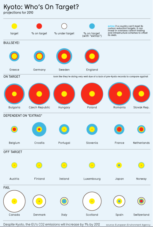
Overexposure to media and information creates a demand for order and sense.

Data from sources of authority, whether it be population figures in a newspaper article, or a politician citing spending figures have a limited context and unless one, has a phD in statistics, economics, international relations and carries around a calculator it is no easy task to extract meaning from the numbers.

Info-graphics/graphic journalism/data-maps are a means of finding threads of logic and in an otherwise meaningless super-abundance of data. Figures are obsolete without context.


A saturation of media and information is one reason why IGs are so effective, another is their potential to turn established facts on their head.

As communicators graphic designers know how information can be tweaked and distorted to serve a purpose, agenda or maybe just a brief. Data presented by editors, corporations, politicians, teachers and even friends can be manipulated into certain directions.

An article that cites a figure or emphasises a particular point creates the impression that certain facts are concrete but rather they are elastic and completely dependant on representation.


It’s rare to find a detailed spreadsheet or anything beyond a rudimentary graph in print media, data is analysed and key figures are selected for presentation. Analyses of figures become facts. Sometimes figures cited in articles and speech can be reductionist to the point of misrepresentation.


Gs can allow readers to make the analysis themselves and draw their own conclusions from the raw data rather than passively absorbing editorial content.

The key difference between mainstream media and IGs is the ability to compress large amounts of data into a singular macro-representation. A well-designed IG has a clarity and breadth of focus that can cut through distortion by selective near-sightedness facilitated by the limits of traditional media communication.

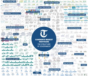
It doesn’t look like there is much of an Visual Journalism presence in Australia. In the UK the Guardian has an excellent dedicated data-blog and the Telegraph has data journalist that supplies graphics and analysis on international and local issues with a range of quality.


http://www.davidmccandless.com/

www.guardian.co.uk/news/datablog

http://www.telegraph.co.uk/journalists/conrad-quilty-harper/

http://www.smh.com.au/nsw/state-budget-2011

Post 4/4: the wonderful world of packaging design

by clea1g

The most compelling packaging works on multiple levels. At the consumer level, packaging should be visually engaging and resonate on both an emotional and rational level with the target audience. For many companies, packaging is the primary means of messaging; and broader brand objectives must be considered when beginning a packaging project. Well designed original and effective packaging will deliver your brand message with great success.

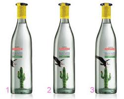
Here are a few good places to begin looking into this area of graphic design:  Pemberton & Whitefoord a UK based company who designed the very clever bottle above for Bambarria tequila. Their website is sort of fun too…

Moxie Sozo are a US co who also do some great packaging design, here are a few examples that caught my eye


Investigate examples of creative packaging for this final post of the term. Due at the end of next weeks class 21/9/11. Thank you.